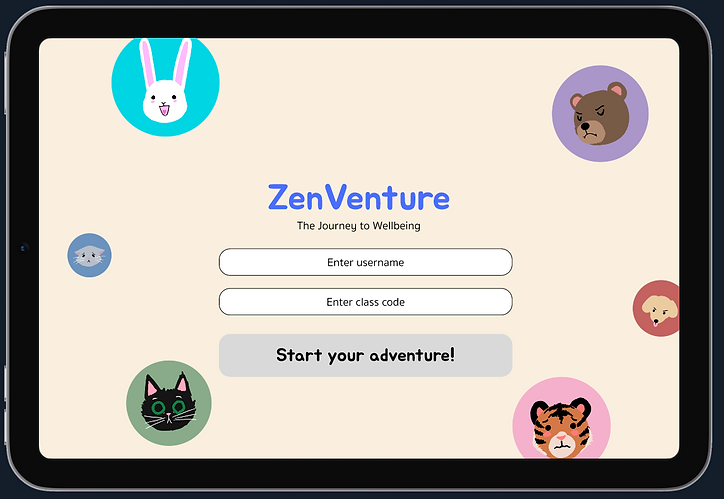
Zenventure
My team and I created a platform aimed at helping primary school students process, understand, and gain awareness about their emotions and mental health. We identified the stakeholders, conducted research with them, designed a solution to the issues we uncovered, and tested our design.

Overview
Role
Research Recruiter
UX Designer
UX Researcher
Tools
Figma
Figjam
Zoom
Timeframe
September 2023 -
December 2023
Team
Adam Vaas
Allana Tran
Ambika Tripathi
Grace Garmo
Rebecca Mao
Vikram Reddy
Summary
My team and I created an app that can be used in classrooms and at home to help kids understand their emotions
During this project, our team aimed to develop a tool for children aged 5 - 10 to better understand and manage their emotions, a critical ability often lacking among this age group. This inadequacy can generate confusion and distress as they approach puberty. We meticulously followed each step of the double diamond design process: defining the problem, investigating existing solutions, conducting user research involving diverse stakeholders, brainstorming concepts, crafting a low-fidelity prototype, testing and improving it, and then advancing to a high-fidelity prototype for further evaluation and refinement. In the end, we developed a tablet application that children can utilize both at school and home to comprehend their emotions and mental well-being.
Project Inpiration/Problem
Children lack the critical skill of understanding their emotions
Children lack a secure, consistent, and trustworthy outlet to express their feelings, whether positive or negative, hindering their overall emotional development and ability to articulate their feelings. Therefore, primary school students need an intuitive and reliable mobile application for effective emotion management that supports the cultivation of emotional well-being.
Goals
-
Create a kid-friendly application that's engaging and informative
-
Provide children with a way to learn about emotions and how to process them
-
Be transparent with educators and parents
-
Create a fully functional clickable prototype


Research
Stakeholder Interviews
My team interviewed children, teachers, parents, and a child psychologist to learn about the problem
Over a week, my team and I conducted interviews with various stakeholders: four children, three parents, three teachers, one childcare worker, and one child psychologist. We utilized a semi-structured interviewing method, employing an interview script that we as a team developed for each stakeholder group. However, we flexibly deviated from the script whenever there was a chance to gather additional information or clarify a interviewee's ideas.
Affinity Diagram
For each stakeholder group we combined our data and completed an affinity diagram using a thematic analysis
We coded all of our interview data and placed it into a figjam board accoding to stakeholder type (child, parent, teacher/childcare professional). Then, we conducted a thematic analysis with each stakeholder group's data.

Interview Takeaways
As a team we came together and carefully extracted valuable insights and information from our affinity diagrams
Children
-
Children have an innate desire to help each other
-
Teachers are very influential on children because they trust them and look up to them
-
Kids don't want to give up, they want to keep trying
-
Enjoy routine's being broken because its fun and different
Teachers/Professionals
-
When a child doesn't understand something they can become frustrated easily and just shut down
-
Kids like working with others and solving problems together
-
Teachers know they have to build trust with their students so they'll listen to them
-
Schools have some mental health resources already including counselors and specific rooms kids can go to refocus
-
Children really like drawing and singing. They also love when a cartoon character they know is incorporated in any way
-
Books, videos, and songs keep children engaged and offer a fun way to teach them things
-
Kids understand topics easier when they're spoken to in simple language and when its repeated to them
Parents
-
When a child gets upset its best to redirect their energy
-
Children don't understand anything about mental health and emotions
-
Kids feel like EVERYTHING is a big deal, they don't give weight to their emotions
Research Deliverables
User Personas
Based on our interview data and the themes we found, we created a user persona for each stakeholder group


User Scenarios
We created a scenrio depicting how each of our stakeholder groups might use our application


Low-Fi Prototype & Iterations
Individual Sketches
Every person on the team sketched out 32 ideas for our design solution
After we knew who we were designing we began ideating as many design ideas as we could by individually sketching them out on paper. After we all finished, we discussed our ideas as a team and started seeing what features and tasks our app should have.

Takeaways
-
We wanted a tool that focused on helping kids process their emotions at school and at home
-
Our app needed to be transparent to parents
-
This tool should help teachers identify students who are struggling and may need further help
-
We wanted to include educational games, books, videos, and shows
-
There should be a place for kids to write their emotions down or draw them out
-
Students should be connected with other kids in their class on the platform
-
Gamify the app so kids stay engaged with it
User Flow Diagram
We decided to focus on the child facing aspect of our app and turned our list of features into a user flow diagram
At this point we decided to focus only on the child's experience because we didn't have the time or resources to develop the entire app with a teacher, parent, and child experience. With our redefined scope, we created a user flow diagram for the child part of the app.

Low - Fidelity Design Walkthrough
Based on our user flow diagram we created some low - fi wireframes and created a prototype we could test
Dashboard & Emotional Scale
The overall idea of our app was to give them a space that was fun and engaging where they could learn about and process through their emotions. When a child first opens the app they are taken to a dashboard where they can see the badges they've earned by doing activities on the app, videos and books they've saved to come back to or started, and an emotional scale.


Activities
When the child first comes to the dashboard they are supposed to complete the emotional scale and report how they are feeling (happy, sad, mad, angry, etc). Then, depending on which emotion they select, the suggested books, videos, and games will change so that these activities match the reported emotion and will help the child understand it. For example, if a child reported that they felt angry on the emotional scale, the videos and books suggested on the activities page would revolve around scenarios in which one of the characters works through and/or copes with their own feelings of anger, thereby giving the child a scenario to relate to and understand the emotion better. Children may browse these activities either through the dashboard or the "Activities" tab, offering a broad range of choices from books, videos, and games, to coloring or writing. These activities function as a positive channel for children to explore and manage their feelings.


Profile & Classroom
Children have the ability to see their profile and information related to their classmates through the "Profile" tab in the navigation bar. Here they can change their avatar, find information about their classmates, and see progress towards class goals set by the teacher.


Usability Testing & Takeaways
Each team member conducted a usability test with our low - fi prototype
After we created our low-fi prototype each member of the team conducted a usability test. Although this application was for kids, we felt testing our low-fi prototype would ineffective because kids wouldn't be able to wrap their head around a barebones application and wouldn't want to interact with a black and white app. So, we conducted usability tests with random people.
Low - Fidelity Design Iterations
We modified our low-fi protoype according to our findings during the usability testing sessions
Our usability testing sessions revealed a variety of issues with our design so we evaluated the problems we identified and modified our designs. We changed the app's navigation menu so the icons matched users' mental models, added a small text label to identify them, and redesigned the dashboard with a clearer emphasis on the emotional scale tool.
Navigation Bar Icons & Dashboard Layout
To fix the issues we found during our sability testing sessions we changed the icons for each page to icons that matched people's mental models better and included a small label for each tab. We also redesigned the content on the dashboard so there was a clearer visual heirarchy and put the emotional scale directly on the dashboard.


Outcomes & Reflection
Project Takeaways
Here's what I learned from this project:
Interviewing and Designing For Children is its Own Profession:
Designing for kids is a whole other beast. Everything from conducting research with them to the style of the play button in a video player is different. I learned how important and difficult it is to keep kids engaged when interviewing them. Surprisingly, it's best to ask kids leading questions for this very purpose - if you ask a child an open ended question they won't respond and get overwhelmed, causing them to shut down. I also learned how to explain complex topics in a way that allows people to understand them.
Listening is Oftentimes the Best Thing You Can Do:
In general listening is important and a vital skill to have. However, this is especially true in a team setting. Whether its listening to everyone's ideas to make everyone feel heard, or listening so you know exactly who is working on which part of the project, its a skill that directly impacts the success of the project.
Collaboration is Key:
A team that collaborates well is more likely to be successful because multiple people with different ideas, perspectives, and backgrounds is always stronger than an individual. Effective collaboaration allows faster problem-solving, promotes innovative thinking, and encourages everyone to meaningfully contribute to the team - all things that contribute to the team's success.
Have Fun and Really Bond With Your Team:
It's okay if some parts of team meetings are spent talking about what everyone did over the weekend, or everyone's favorite cartoons growing up. Bonding with your team members over these things helps the group gell together, which helps build trust and confidence within the team.
Similar Projects
Vouch
UX/UI Design, E-Commerce, UX Research
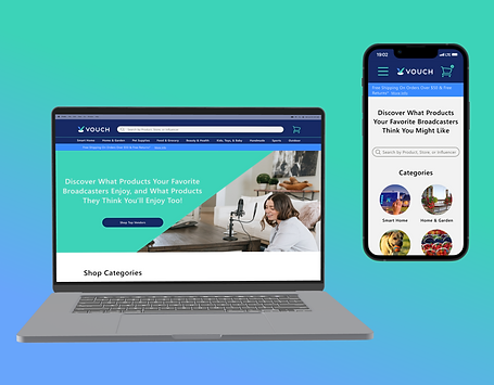
I crafted user-centric wireframes for the Vouch project, ensuring an excellent e-commerce experience within budget and project constraints.


